 Safari 4 Beta
Developed and Released by Apple
For Windows XP, Vista, 7 Beta (unofficially) and Mac OS X Tiger, Leopard
Oh yes, I remember Apple releasing version 3 of this same browser a few years ago.
It sucked.
So this pretty much meant that I had low expectations performance-wise while downloading this new beta, but I was in for a shocker when I completed installation and restarted the system. It just works wonderfully.
Not only is the file size significantly smaller, the performance is snappier, features do as advertised, and Windows users may just have a new viable option for an alternate browser.
While the stable release- Safari 3.1.2- is pretty decent in its own right, this one adapts some killer features, even if they're not as "killer" in comparison to tabs or the awesome bar in Mozilla Firefox, or individual tab management (when one tab hangs, the others don't get affected even if they're in the same window) in Google Chrome.
Let's get to the part that matters first: speed and stability.
While I have yet to try Safari for Windows, Safari pretty much opens slightly faster than the old version. Of course, first open is gonna be slower than usual, but later opens will be purportedly as fast as Chrome.
Then there's the website rendering. At first, my experience was rather slow, but later it somehow accelerated. I'm not sure if I was downloading some torrents at the time, but when I randomly opened my computer and opened the browser one time, sites were loading like fire- as fast as Chrome, or maybe marginally faster- and it has been that way ever since.
Web site render speeds can be attributed to the new Nitro engine built for Apple's WebKit (WebKit is also the same engine running Chrome, since it is open source and standards-compliant), and not only does it pass the new Acid3 test without errors, it also introduces compliance with a new proposed standard called CSS Animation- a Flash substitute that requires no new plug-ins.
And for a beta, it's actually very stable. I have yet to encounter a crash, and it cruises on smoothly.
Now we're getting too technical, but does Safari go too technical on your ass? Let's see how user-friendly it is.
If you've been using Safari for a while, you'll notice quite a change in this beta. While the interface is deemed tentative, it's rather impressive.

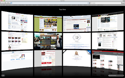
So what's the most noticeable change? The "Top Sites" page, that's what. Yes, you can set Top Sites to be your home page, and while it is just a prettier version of the Speed Dial feature in Opera or the home page of Chrome, it has a twist.
For example, you press the thumbnail of a site you usually visit in Opera or Chrome, but then you find out that there's not even an update available. Whoops! Time wasted. Well, in Top Sites, you can find out whether a site has new content or new feeds. This is marked by a Blue star on the upper right of the website's thumbnail.
Additionally, you can press the small Edit button on the lower-left to adjust the positions of the each site, or pin a site permanently in its place so it won't get replaced, or add and reduce the number of displayed sites.
But there's a catch: Top Sites won't accept specific input from the user- meaning that you can't put your own website for display in the page. It only displays the pages you visit most- which is pretty much the purpose of this new feature. While I love using this feature because it's both beautiful and practical, I'd still like to be able to input my own sites.
But what's the Search bar in the lower-right portion of the Top Sites page? Well, when you click it, the last page you've visited is displayed in Cover Flow mode, and when you type, the search narrows down by letter.
The thumbnails in Cover Flow are thumbnails of the sites as you visited them, and you can also search a portion of a web site. For example, you only remember a shred of text from a website, or maybe I just want to look for pages that have the words 'touch screen phones' in them because I want to look at some phones (pictured above). Well, this comprehensive search can do that.
The search is not only limited to History, Bookmarks can be searched as well when you click the Bookmarks icon on the toolbar.
I think Cover Flow is most practically applied in Safari, because you get a huge thumbnail of a website you visited. It's so big that you don't even have to open it again just to check if it is indeed the correct page you were looking for. Of course, that is if you're not gonna read the whole article located inside the page.
Speaking of Search, it also finally supports search suggestions (that is, if you choose Google to be your search provider) thus making the need for the Inquisitor plug-in unnecessary.
A new feature taken for granted is the improved zoom feature. Typically, when you zoom in on a website, the pictures don't really get zoomed in together with the text. But like the iPhone, Safari can now magnify web pages as well as their pictures. Small screens will benefit from this greatly, you know like a netbook? (Pictured below is the magnified Apple Online Store.)
Overall, Safari 4's Beta version is very stable, solid, and most importantly fast. It also features some great features, but some of the interface changes, like the tabs placed on top, the lack of a Chrome-like system for managing tabs and the Refresh and Stop button placed on the address bar, may piss some people off.
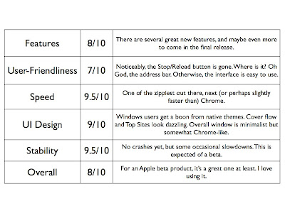
Comprehensive Ratings:


No comments:
Post a Comment